
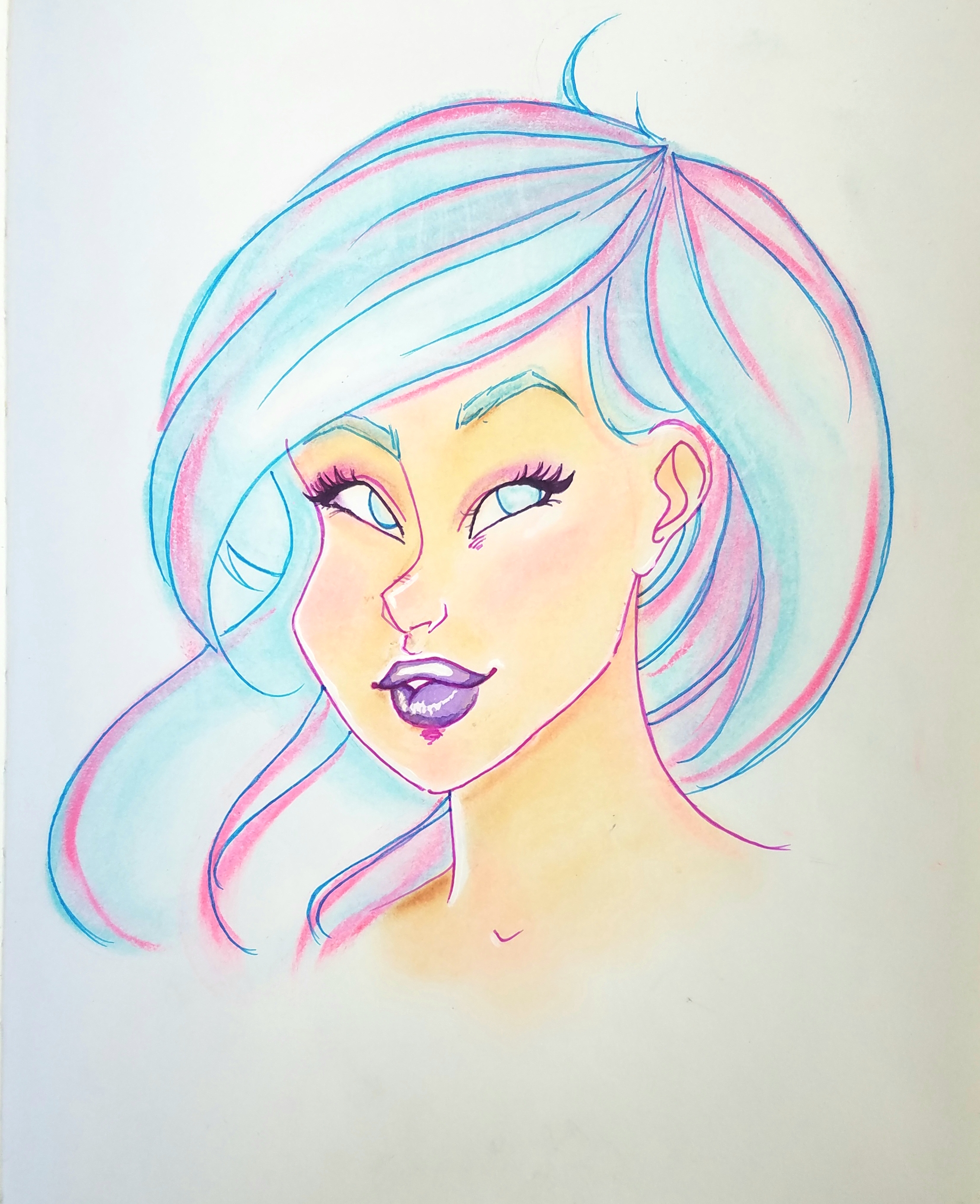
I need a scanner or something. The photo isn’t even close to what this looks like on real life; her cheeks are supposed to be NEON! harumph.
I need a scanner or something. The photo isn’t even close to what this looks like on real life; her cheeks are supposed to be NEON! harumph.
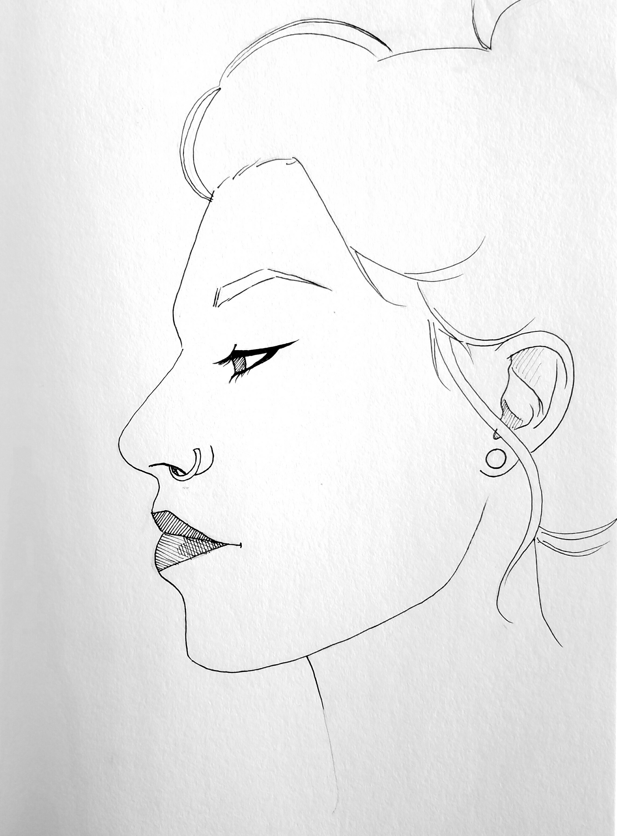
Been doing a lot of sketches lately, nothing great to share. But I kind of liked this, even if I look like an old lady. Based off of a photo I took of myself.
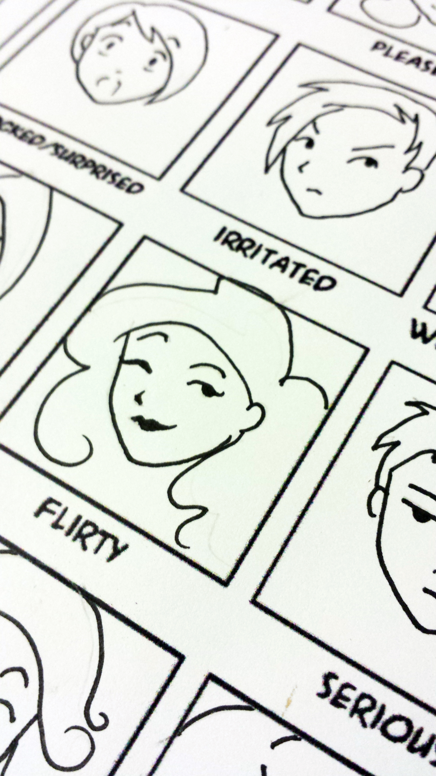
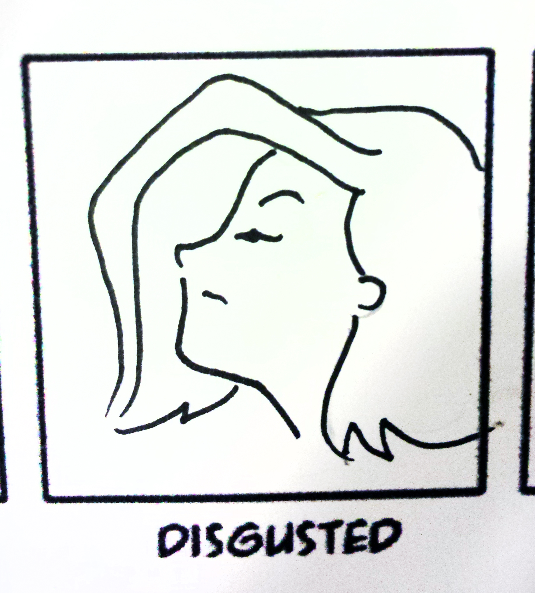
Homework #2. I did this SO WRONG. Haha. There was a warmup exercise with 24 practice faces (the same 12, two times), that were supposed to be QUICK, SIMPLE drawings. This expressions sheet was supposed to be 25 faces, I THINK with time involved, and the same person 24 times. I instead did these as simple doodles and let the face be whatever it felt like. Oops. I don’t like all of them, so I only included two I liked here.
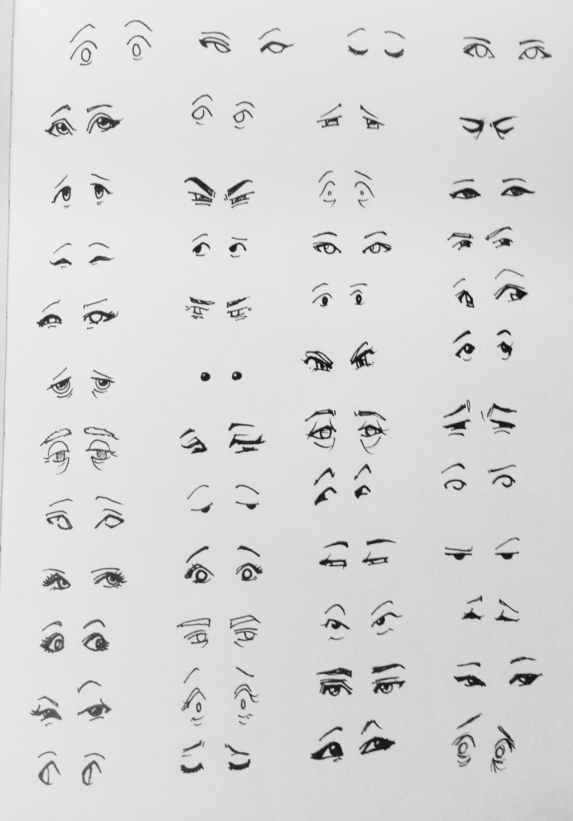
The other exercise was 50 sets of eyes, in ink. What’s interesting is I think the expressions and age/sex variation in the eyes got more varied as I went on, because I was struggling to make them different from each other. …And yes there’s only 48. Shh.
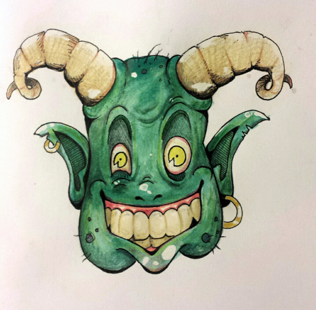
I don’t know why this is so horrifying. Definitely not my usual lady portrait!
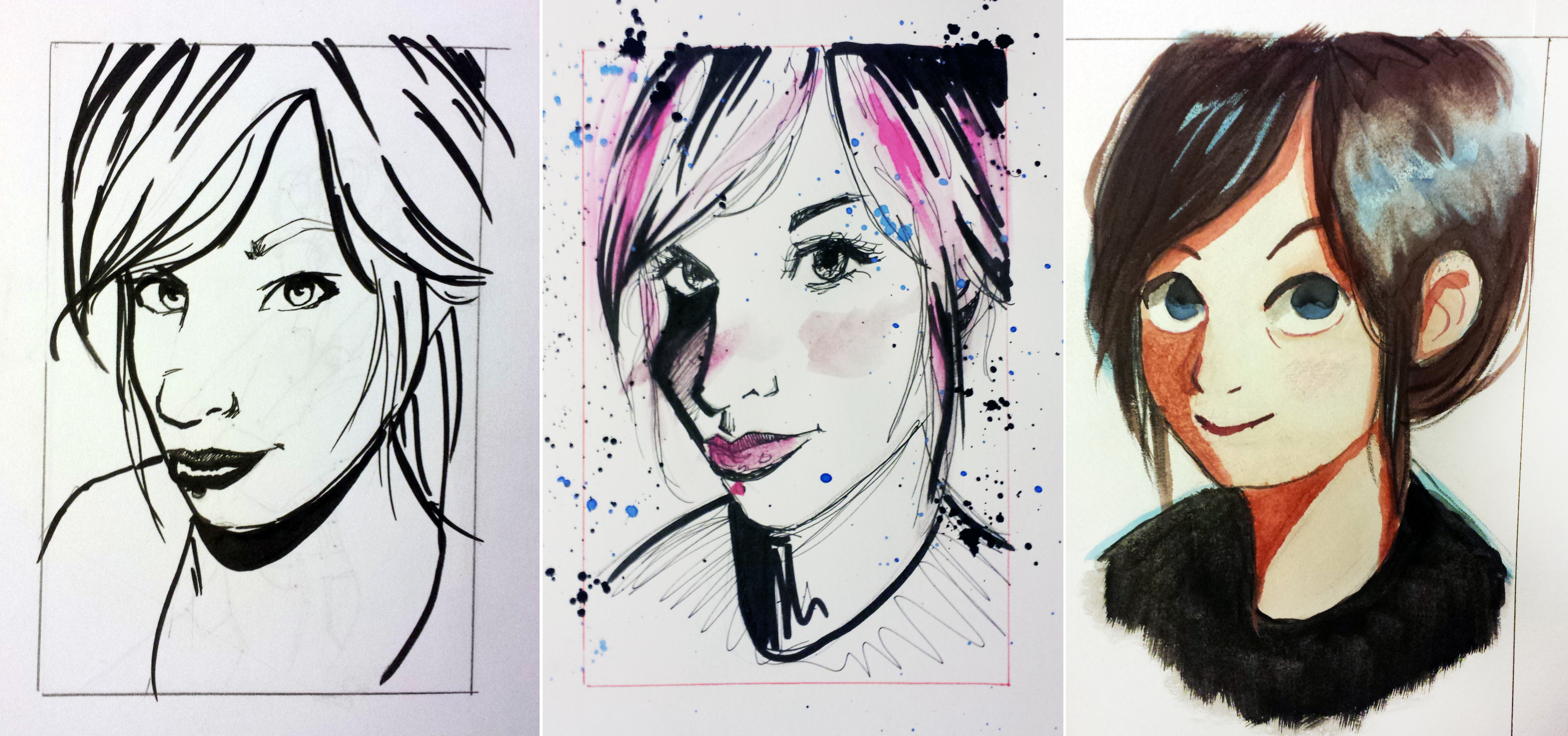
This was my first assignment for an online illustration course I’m taking. Take an image (in this case, a random profile photo that showed up in my Facebook Feed… thank you Lacey for unknowingly becoming my subject!) and draw the image in three distinctly different styles of other artists you like.
1) Describe each style you chose to emulate. I tried Fiona Staples, Jim Mahfood, and Ira Sluyterman van Langeweyde. Fiona is really good at economy of line, and doing a lot with a little (linework, that is). Jim is all over the place and wild, and I don’t think mine was very successful. His hand is loose and he balances heavy ink with tiny quick lines. Ira’s style is super cute, round, and soft, with big eyes and a beautiful use of controlled watercolor and depth/shadow.
2) What did you learn while working on each of these? I feel like my own “style” is more unique than I thought, because purposely trying to copy other styles was REALLY FREAKING HARD. Way harder than I expected. I’m also too impatient to spend lots of time on one drawing…but I think I knew that about myself already.
3) Which one was easy for you? Which one was the most challenging? Why? The watercolor, surprisingly, I think came out the best. But my impatience and inexperience with them led me to painting too soon on wet areas that I assumed were dry, and then lots of bleeding and trying to fix it…oops. Jim’s style was the hardest. I think I really struggled against my natural movements and control. It felt more like my lines were an afterthought and trying to make it look messy than really understanding the process itself.
4) What elements of your experience would you like to apply to future projects? I really like the use of watercolor for color and shading (I used to use marker a lot, but I like how the watercolor came out. I think I need to try to break out of my comfort zone more often in general. Too often I think I draw from habit and muscle memory, which isn’t really good practice. I mean, it is, but not in a necessarily beneficial way that will grow my skill and make me a more versatile artist.
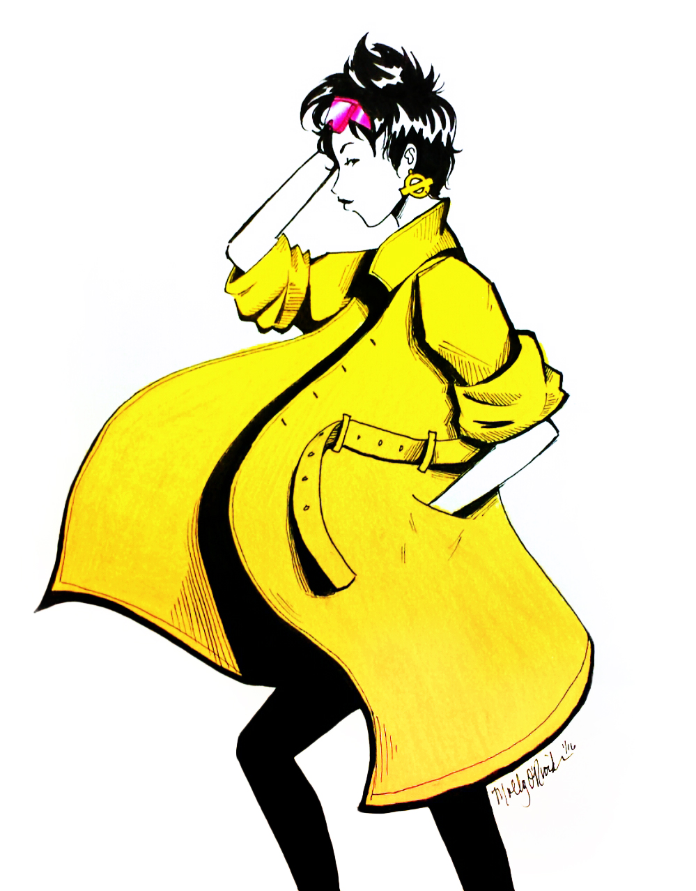
Ink and colored pencil. It’s difficult to do these things without a photo reference, but I like how it turned out!